Mobile Menu

Effortlessly build forms & capture leads with our open source form builder

Transform the way you capture and manage data with Webiny’s Form Builder. Break free from technical constraints and design forms that resonate with your audience. Discover a no-code solution that simplifies data collection, enabling you to focus on what truly matters - making informed decisions.

Use Webiny Form Builder when you need to:

Empower marketing teams to autonomously create lead-gen forms

Create forms and serve them via Page Builder pages

Create workflows and integrate with tools like Zapier

Integrate with 3rd party systems and APIs

Book A Demo

What is Webiny’s Open Source Form Builder?

Webiny's Form Builder is like having an easy-to-use toolkit to create various online forms without any technical hassle. Whether you need to collect information from your customers, get sign-ups for an event, or create a quick poll, Form Builder allows you to do all that and more without needing to write a single line of code.

Lorem ipsum dolor sit amet, consectetur adipiscing elit. Cras iaculis et libero eget eleifend. Vestibulum felis ipsum, aliquet eget semper at, eleifend non nisl.

Everything you need from a complete no-code experience

Drag & drop form editor

Several field types to choose from

Attach validation rules

Attach terms of service policy

Preview changes before they go live

Book A Demo

The foundation behind Webiny

The end-to-end platform that Webiny provides solves challenges around data ownership, customizations,
infrastructure cost, scalability & reliability and helps you manage the full content lifecycle.

Lorem ipsum dolor sit amet, consectetur adipiscing elit. Cras iaculis et libero eget 

eleifend. Vestibulum felis ipsum, aliquet eget semper at, eleifend non nisl.

Multi-tenancy

Host thousands of projects from a single instance

Learn more  →

Open source

Architected to be extended and customized.


Learn more  →

Self-hosted

Your data under your terms. A privacy-focused CMS.

Learn more  →

AWS Serverless Infrastructure

Webiny runs on highly-scalable fault-tolerant serverless services. 

Learn more  →

Development framework

Build new features, change existing ones, or create whole new apps.

Learn more  →

CMS+

No-code suite of solutions helping you create, manage and distribute content.

Learn more  →

Get a demo

Lorem ipsum dolor sit amet, consectetur adipiscing elit. Cras iaculis et libero eget eleifend. Vestibulum felis ipsum, aliquet eget semper at, eleifend non nisl.

Automate form workflows with triggers

Send an email to the user when they submit the form

Get an email notification on your end when a form is submitted

Redirect a user to a specific page after they send the form

Integrate with Zapier via webhooks, or any other 3rd party system

Integrate your analytics tools directly via JS or through Google Tag Manager

Book a demo

It’s a platform your engineering team will love using

Lorem ipsum dolor sit amet, consectetur adipiscing elit. Cras iaculis et libero eget eleifend. Vestibulum felis ipsum, aliquet eget semper at, eleifend non nisl.

Typescript support

Type definitions across the whole project to help you get around.

Deploy to multiple environments

Using Webiny CLI you can propagate code trough different environments, like dev, prod.

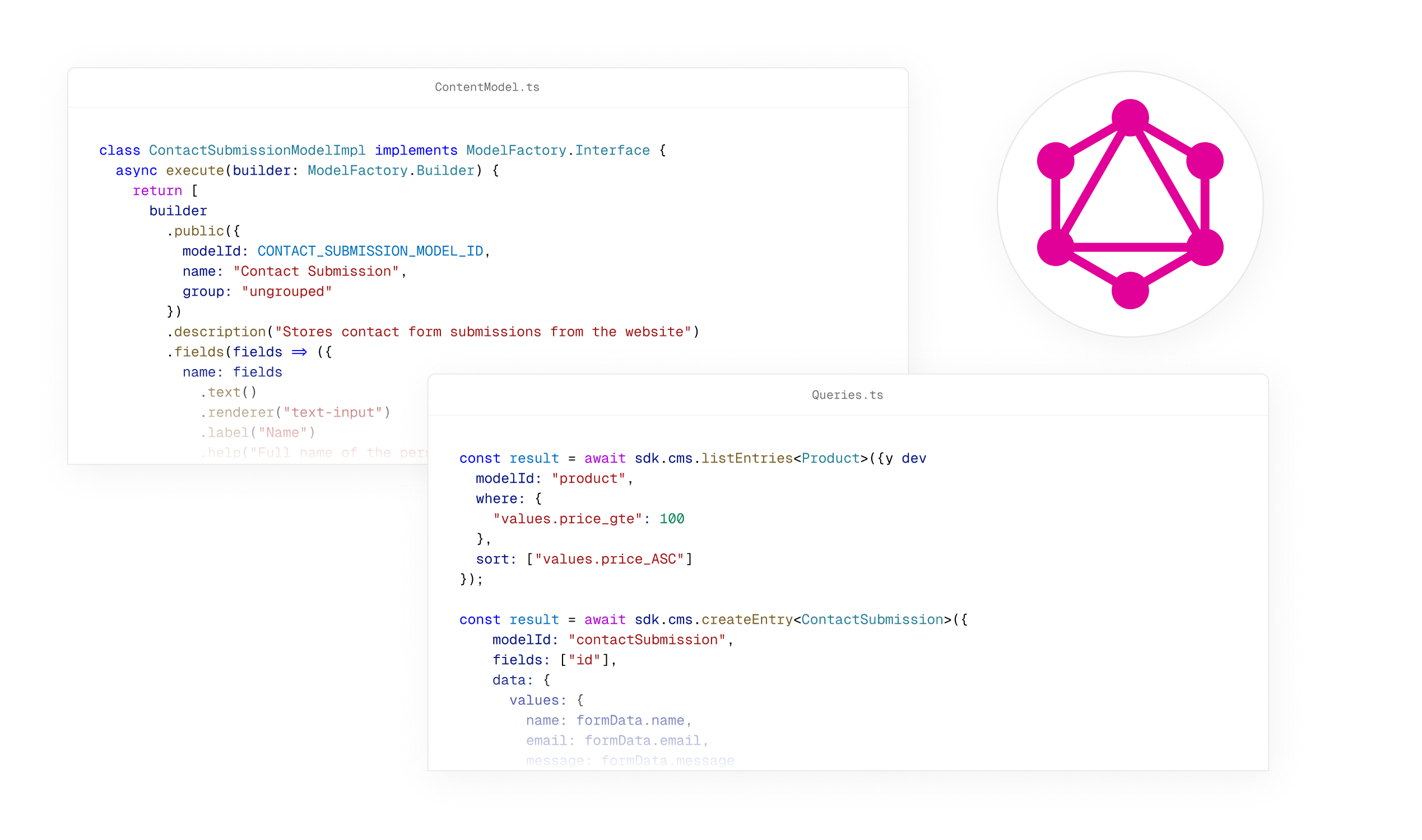
Extendable GraphQL API

Change existing GraphQL resolvers, or add new ones in a few lines of code.

SOC2 compliant setup

Webiny is deployed inside your AWS account following all security best practices.

Bring your own IdP

You can integrate any of your existing IdPs.

Pulumi IaC

Control and modify your infrastructure through Pulumi IaC.

70+

Contributors

2,700+

Developers on Slack

7,200+

GitHub stars

When we say customizable & extendable, we really mean it!

Webiny is architected from the ground up to be adopted, extended and built upon. You can literally change every part of Webiny, in a safe and maintainable way.

  • Headless CMS - Data List

  • Page Builder - Editor

  • File Manager - File details

  • GraphQL API

Trigger custom functions

Lifecycle events are added on top of folder actions which can be used to trigger custom functions.

1
2new ContextPlugin<AcoContext>(async context => {
3 context.aco.onFolderAfterCreate.subscribe(async ({ folder }) => {
4 // Trigger custom function here
5 console.log('Folder created', folder.title);
6 });
7});
8

Register a custom bulk action

When selecting multiple entries, you can register custom bulk actions that the user can perform.

1
2<ContentEntryListConfig>
3 <BulkAction
4 name={"copy-json"}
5 element={<ActionCopyJson />}
6 modelIds={["article"]}
7 />
8</ContentEntryListConfig>
9

Register a custom filter

You can register custom filters to filter the entries in the list.

1
2<ContentEntryListConfig>
3 <Browser.Filter name={"demo-filter"} element={<span>Demo Filter</span>} />
4</ContentEntryListConfig>
5

Show/hide columns

Configure on a per-model basis which columns are shown in the list view.

1
2<ContentEntryListConfig>
3 <Browser.Column
4 name={"price"}
5 header={"Price"}
6 modelIds={["property"]}
7 />
8</ContentEntryListConfig>
9

Custom column renderer

Control how a column is rendered in the list view.

1
2export const CellPrice = () => {
3 // You can destructure child methods to make the code more readable and easier to work with.
4 const { useTableRow, isFolderRow } = ContentEntryListConfig.Browser.Table.Column;
5 // useTableRow() allows you to access the entire data of the current row.
6 const { row } = useTableRow();
7
8 // isFolderRow() allows for custom rendering when the current row is a folder.
9 if (isFolderRow(row)) {
10 return <>{"-"}</>;
11 }
12
13 const currency = new Intl.NumberFormat("en-US", {
14 style: "currency",
15 currency: row.currency // Let's use the currency defined in the entry.
16 });
17
18 // Let's render the entry price.
19 return <>{currency.format(row.price)}</>;
20};
21<ContentEntryListConfig>
22 <Browser.Column
23 name={"price"}
24 header={"Price"}
25 modelIds={["property"]}
26 cell={<CellPrice />}
27 />
28</ContentEntryListConfig>
29

Customize search query

Customize how search query works and how the input parameters are handled.

1
2export const CellPrice = () => {
3 // You can destructure child methods to make the code more readable and easier to work with.
4 const { useTableRow, isFolderRow } = ContentEntryListConfig.Browser.Table.Column;
5 // useTableRow() allows you to access the entire data of the current row.
6 const { row } = useTableRow();
7
8 // isFolderRow() allows for custom rendering when the current row is a folder.
9 if (isFolderRow(row)) {
10 return <>{"-"}</>;
11 }
12
13 const currency = new Intl.NumberFormat("en-US", {
14 style: "currency",
15 currency: row.currency // Let's use the currency defined in the entry.
16 });
17
18 // Let's render the entry price.
19 return <>{currency.format(row.price)}</>;
20};
21<ContentEntryListConfig>
22 <Browser.Column
23 name={"price"}
24 header={"Price"}
25 modelIds={["property"]}
26 cell={<CellPrice />}
27 />
28</ContentEntryListConfig>
29

Custom action on an entry

Remove or register new actions that can be performed on an entry.

1
2<ContentEntryListConfig>
3 <Browser.EntryAction
4 name={"copy-json"}
5 element={<CopyEntryData />}
6 modelIds={["property"]}
7 />
8</ContentEntryListConfig>
9

Custom element group

Register a custom element group

1
2export default {
3 name: "pb-editor-element-group-webiny-website",
4 type: "pb-editor-page-element-group",
5 group: {
6 title: "Webiny Website",
7 icon: <Icon />
8 }
9} as PbEditorPageElementGroupPlugin;
10

Custom element

Register a custom element you can use to build your page

1
2const plugin = {
3 name: "pb-render-page-element-space-x",
4 type: "pb-render-page-element",
5 elementType: "spaceX",
6 render: SpaceX
7} as PbRenderElementPlugin;
8

Control element nesting

Create advanced nestable elements and control where and how they can be nested

1
2const plugin = {
3 name: "pb-render-page-element-child-example",
4 type: "pb-render-page-element",
5 elementType: "childExample",
6 render: ChildExample,
7 // Whitelist elements that can accept this element
8 // (for drag&drop interaction)
9 target: ["cell", "block"],
10} as PbEditorPageElementPlugin;
11

Interactive elements

Create elements that are interactive and can also fetch data from external sources

1
2export const SpaceX = createRenderer(() => {
3 // Let's retrieve the variables that were chosen by
4 // the user upon dropping the page element onto the page.
5 const { getElement } = useRenderer();
6 const element = getElement<SpaceXElementData>();
7 const { limit, offset, type } = element.data.variables;
8
9 const [data, setData] = useState<Spacecraft[]>([]);
10
11 // This is where we fetch the data and store it into component's state.
12 useEffect(() => {
13 request(GQL_API_URL, QUERIES[type], {
14 limit: parseInt(limit),
15 offset: parseInt(offset)
16 }).then(({ data }) => setData(data));
17 }, [limit, offset, type]);
18
19 if (!data.length) {
20 return <>Nothing to show.</>;
21 }
22
23 return <>SpaceX has {data.length} rockets</>;
24});
25
26const plugin = {
27 name: "pb-render-page-element-space-x",
28 type: "pb-render-page-element",
29 elementType: "spaceX",
30 render: SpaceX
31} as PbRenderElementPlugin;
32

Style plugins

Register custom plugins to define new style props, or remove existing style props

1
2export default {
3 name: "pb-editor-page-element-style-settings-text",
4 type: "pb-editor-page-element-style-settings",
5 render({ options }) {
6 return <TextSettings options={options} />;
7 }
8} as PbEditorPageElementStyleSettingsPlugin;
9

Element plugins

Register custom attributes for your custom elements. Example, define which category of products will be listed inside your custom listing component.

1
2export default {
3 name: "pb-editor-page-element-advanced-settings-carousel",
4 type: "pb-editor-page-element-advanced-settings",
5 elementType: "carousel",
6 render() {
7 return <CarouselItems />;
8 }
9} as PbEditorPageElementAdvancedSettingsPlugin;
10

Extend page settings

Remove page settings props you don't need. Create custom page settings props for your own needs.

1
2export default [
3 // Add 'password' to the page settings types
4 new GraphQLSchemaPlugin<Context>({
5 typeDefs: /* GraphQL */ `
6 extend type PbGeneralPageSettings {
7 password: String
8 }
9
10 extend input PbGeneralPageSettingsInput {
11 password: String
12 }
13 `
14 }),
15 // Subscribe to the page update event using the ContextPlugin.
16 new ContextPlugin<PbContext>(({ pageBuilder }) => {
17 // We are passing a custom event type to allow us to use the new 'password' field.
18 pageBuilder.onBeforePageUpdate.subscribe<CustomEventParams>(({ page, input }) => {
19 // Explicitly assign the field value from GraphQL input to the data that is used to update the page.
20 page.settings.general.password = input.settings.general.password;
21 });
22 })
23 ];
24

Lifecycle events

Take over the publish button action and trigger a custom action. Or an action that happens before or and after the page publish event.

1
2new ContextPlugin<PbContext>(async context => {
3 context.pageBuilder.onBeforePagePublish.subscribe(async ({ latestPage, page }) => {
4 /**
5 * For example, we do not allow a page which is not the latest one to be published.
6 */
7 if (latestPage.version > page.version) {
8 throw new Error(`Page you are trying to publish is not the latest revision of the page.`);
9 }
10 });
11 });
12

Custom file type

Register a plugin to add a new file type handler to the file manager

1
2export default [
3 new FileManagerFileTypePlugin({
4 types: ["video/mp4"],
5 render({ file }) {
6 return (
7 <div style={{ paddingTop: "40%" }}>
8 <strong>My MP4</strong>
9 <br />
10 <span>{file.name}</span>
11 <br />
12 <span>{file.size} bytes</span>
13 </div>
14 );
15 }
16 })
17];
18

Custom File Manager UI

Register your own custom File Manager UI, useful if you want to use a different DAM system, something like Cloudinary, Dropbox, etc.

1
2const CustomFileManager = createDecorator(FileManagerRenderer, () => {
3 return function FileManagerRenderer(props) {
4 const setRandomImage = () => {
5 const id = Date.now().toString();
6 const image: FileManagerFileItem = {
7 id,
8 src: `https://picsum.photos/seed/${id}/200/300`,
9 meta: [{ key: "source", value: "https://picsum.photos/" }]
10 };
11 if (props.multiple) {
12 props.onChange && props.onChange([image]);
13 } else {
14 props.onChange && props.onChange(image);
15 }
16 props.onClose && props.onClose();
17 };
18
19 return (
20 <OverlayLayout onExited={() => props.onClose && props.onClose()}>
21 {/* Render a simple button, and assign a random image on click. */}
22 <button onClick={setRandomImage}>Set random image</button>
23 </OverlayLayout>
24 );
25 };
26 });
27
28 export const App = () => {
29 return (
30 <Admin>
31 <Cognito />
32 {/* Mount the plugin, which will register a HOC for the `FileManagerRenderer`. */}
33 <CustomFileManager />
34 </Admin>
35 );
36 };
37

Custom file filters

Create a custom filter that can be used to filter files in the File Manager

1
2const { Browser } = FileManagerViewConfig;
3
4const DemoFilter = () => {
5 return <span>Demo Filter</span>;
6}
7
8export const App = () => {
9 return (
10 <Admin>
11 <Cognito />
12 <FileManagerViewConfig>
13 <Browser.Filter name={"new-filter"} element={<DemoFilter />} />
14 </FileManagerViewConfig>
15 </Admin>
16 );
17};
18

Custom file fields

Add custom meta data fields to your files

1
2export const handler = createHandler({
3 plugins: [
4 // Other plugins were omitted for clarity.
5
6 // Add the following code after your existing plugins.
7 createFileModelModifier(({ modifier }) => {
8 modifier.addField({
9 id: "carMake",
10 fieldId: "carMake",
11 label: "Car Make",
12 type: "text",
13 renderer: {
14 name: "text-input"
15 }
16 });
17
18 modifier.addField({
19 id: "year",
20 fieldId: "year",
21 label: "Year of manufacturing",
22 type: "number",
23 renderer: {
24 name: "number-input"
25 }
26 });
27 })
28 ],
29 http: { debug }
30});
31

Customize File Details Drawer

Change the UI of the details drawer. You can change the size of the drawer, hide fields, and group fields.

1
2<FileManagerViewConfig>
3 {/* Use percentage value. */}
4 <FileDetails.Width value={"80%"} />
5 {/* Use pixel value. */}
6 <FileDetails.Width value={"1300px"} />
7</FileManagerViewConfig>
8

File lifecycle events

You can listen to file lifecycle events, such as file upload, file delete, etc. and trigger custom functions.

1
2new ContextPlugin<FileManagerContext>(async context => {
3 context.fileManager.onFileAfterCreate.subscribe(async ({ file }) => {
4 // Send a notification to Slack, or any other service.
5 await sendNotificationToSlack({
6 text: `New file created: ${file.name}`
7 });
8 });
9 });
10

Extend the GraphQL API

Extend the GraphQL types and operations

1
2new CmsGraphQLSchemaPlugin<Context>({
3 // Extend the `Query` type with the `listMyPosts` query. Note the `PostListResponse` type.
4 // It exists because we've previously created the `Post` content model via Admin Area.
5 typeDefs: /* GraphQL */ `
6 extend type Query {
7 # List posts that were created by the currently logged in user.
8 listMyPosts: PostListResponse
9 }
10 `,
11 // In order for the `listMyPosts` to work, we also need to create a resolver function.
12 resolvers: {
13 Query: {
14 listMyPosts: async (_, args: { id: string }, context) => {
15 const { security, cms } = context;
16
17 // Retrieve the `post` model.
18 const model = await cms