Page Builder > Theming
Theme Object
Learn about the theme object and how it's used in the code.
- what are the different properties of the theme object
- how to properly access the theme object in the code
Overview
The theme object defines different visual aspects of our website, for example the default set of colors, typography, breakpoints, and more.
Apart from being used in the code by different page elements, the theme object is also integrated with different editors that are available in the Page Builder’s application, like page or block editor.
For example, colors or different typography options defined in the theme object are automatically picked up by these editors, enabling users to select them while building content and ensuring everything stays visually consistent.
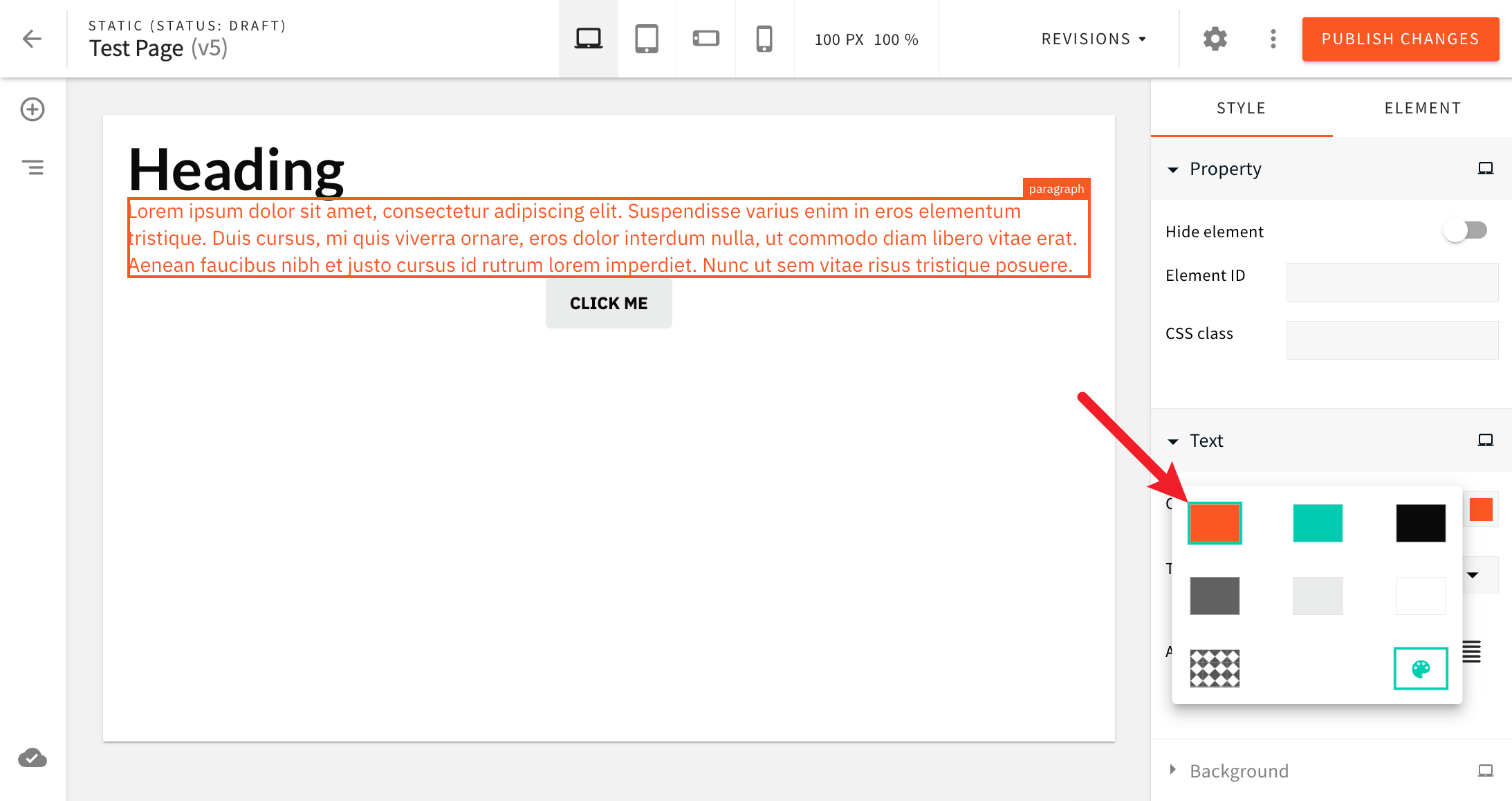 Theme Colors Available In The Color Picker
By default, the theme object is exported from the extensions/theme/src/theme.ts file, and it looks like the following:
In the following text, we cover all the different properties of which the theme object consists of.
Properties
Breakpoints
Via the breakpoints object, the theme object defines four available breakpoints:
- desktop
- tablet
- mobile (landscape orientation)
- mobile (portrait orientation)
Note that the property names of these breakpoints (desktop, tablet, mobile-landscape, mobile-portrait) should not be changed. But, the assigned media queries can be adjusted and new ones can be introduced, if need be.
Colors
Via the styles.colors object, the theme object defines theme colors, where property names represent the IDs of colors and values respective color codes.
The IDs of colors don’t follow any naming convention. Upon introducing new colors, IDs like primaryColor or myCustomColor will work as well.
Typography
Via the styles.typography object, the theme object defines theme typography. Unlike with breakpoints and colors, property names here represent the typography categories, and values array of different typography variants. For example, in the following code snippet, we can see six different heading variants being defined:
Every typography variant consists of the following properties:
| Property | Description |
|---|---|
id | A unique ID of the typography variant. Like with colors, typography IDs don’t follow any naming convention. Upon introducing new typography, IDs like primaryTypography or myCustomTypography will work as well. |
name | A human-readable name of the typography variant. Will be shown in different Page Builder editors like page or block editor. |
tag | A HTML tag that will be used to render the typography variant. |
styles | A CSS object that defines the visual appearance of the typography variant. |
Note that, when accessing the theme object and different typography variants, to make it easier, we can leverage the
special stylesById getter function. More on this below, in the Accessing the Theme
Object section.
Page Elements
Respectively, the styles.elements object enables defining and overriding styles for new and existing page elements. Like with colors and typography, property names represent the IDs of page elements, and values respective CSS rules that define them visually.
By default, the property contains styles for default document and button page elements, but note that styles for custom ones can be added here as well.
To learn more about custom page elements, check out the existing Create a Custom Page Element article.
Accessing the Theme Object
While styling page layouts or custom page elements, the theme object can be accessed in order to use the styling rules defined in it. To access the theme object, we rely on Emotion’s suggested approach, which is through the React context.
The easiest way to access the theme object is via styled components, like in the following example:
As we can see, the theme object is available via the props argument of the styled component’s template literal function. This means that we can access any of the theme object’s properties, like styles.colors, styles.typography or styles.elements.
Note that the theme object should not be accessed by directly importing the extensions/theme/src/theme.ts file. This can
lead to issues in multi-theme projects, where the theme object is not the same for all themes.
Multiple examples of accessing the theme object can be found in the Static page page layout code that’s included by default in all new projects. The code is located in the extensions/theme/src/layouts/pages code folder.
More information on page layouts can be found in the following Page Layouts article.
Accessing Typography Variants
When accessing typography variants, we can leverage the special stylesById getter function, like in the following example:
As we can see, the stylesById getter function accepts a typography variant ID as an argument, and returns a CSS object that defines the visual appearance of the typography variant. This way, we can easily access different typography variants, without having to manually traverse the styles.typography object.
Custom Page Elements
If needed, theme object can also be accessed when creating custom page elements, via the useRenderer React hook. For example:
Most often, styles for custom page elements are introduced via one or more standalone Emotion styled components.
Responsive Styles
The theme object allows users to define responsive styles for all of the above mentioned properties. Consider the following example:
In this example, we’ve defined responsive styles for the heading1 typography variant. This means its styles will be different depending on the device’s screen size. For desktop, the font size will be 48px, for tablet it will be 36px, for mobile-landscape it will be 24px, and for mobile-portrait it will be 20px.
Note the use of breakpoint names (like desktop, tablet, etc.) instead of breakpoint values (like @media (max-width: 4000px)). This is because the theme object automatically converts breakpoint names to breakpoint values, based on the breakpoints constant defined at the top of the extensions/theme/src/theme.ts file (and assigned via the breakpoints property in the exported theme object).
FAQ
When Defining Custom Theme, Should I Create a Copy of the Theme or Can I Just Override the Values I Need?
In general, it depends on your needs and personal preference. There’s nothing wrong with simply overriding the values you need.
Is Having Multiple Themes Supported Out of the Box?
Out of the box, every Webiny project starts with a single theme (the one located in the extensions/theme folder. For a multi-theme setup, please take a look at the Setup Theme Manager article.