Page Builder > Extensions
Lexical Editor
Configure the Lexical Editor in Page Builder.
This feature is available since Webiny v5.x.
Overview
Webiny uses Lexical Editor to allow users to create rich text content quickly. Lexical Editor is created by Meta, it’s open source, and very customizable. To learn more about how Lexical Editor works, check the official docs.
In this article, we’ll cover the Lexical Editor configuration for the Heading and Paragraph elements of the Page Builder page editor. The configuration includes toolbar actions, plugins, and Lexical nodes.
 Heading element
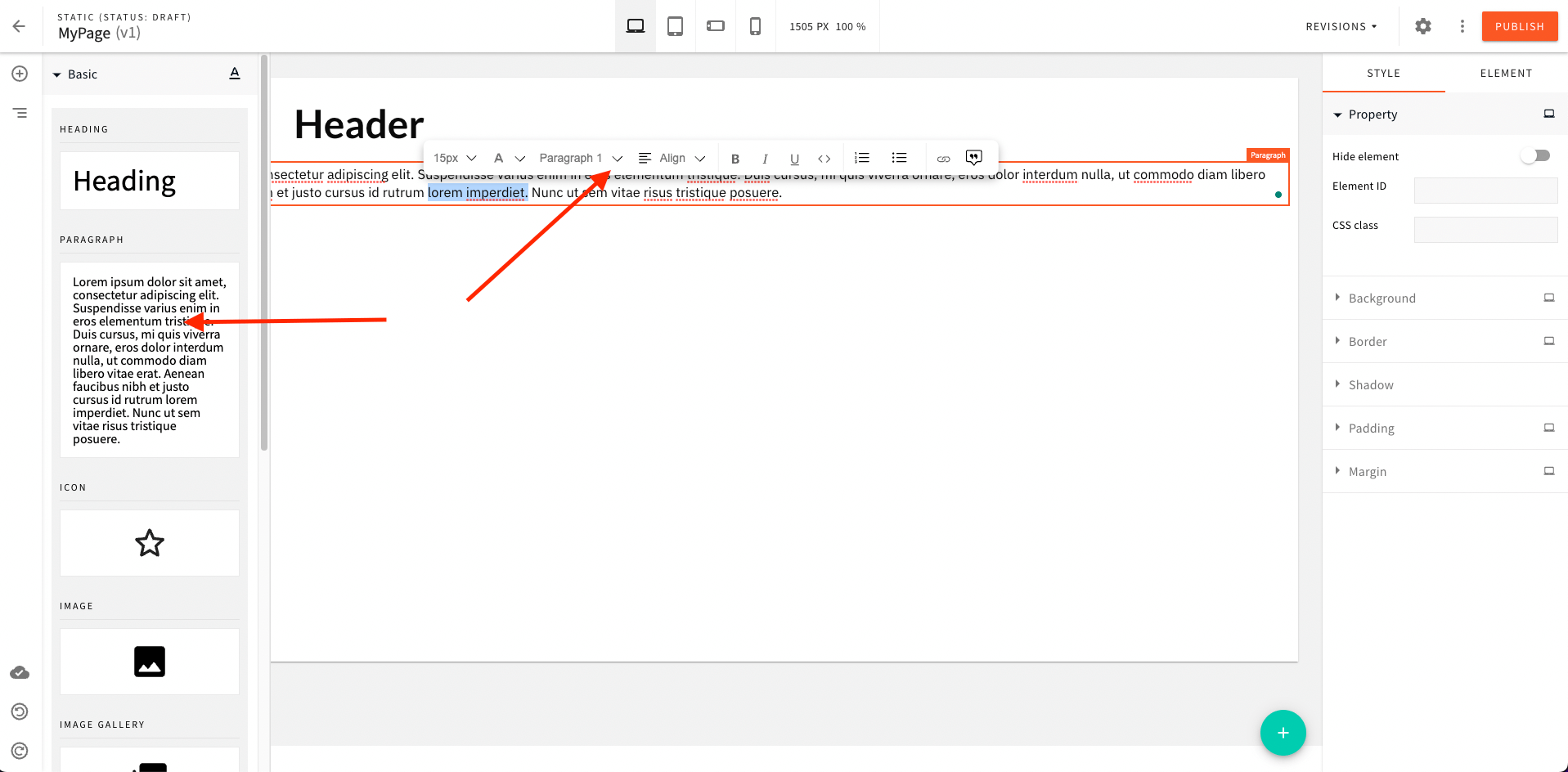 Paragraph element
Heading Element
Heading element is used for adding headings. It has its own actions, plugins and nodes, which are separated from the Paragraph element, and thus, have a separate namespace with configuration components.
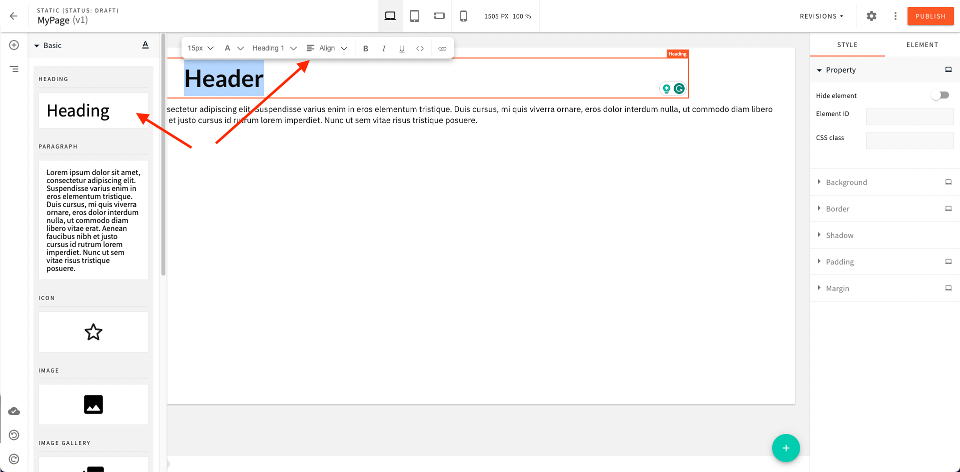
Toolbar
Page Builder uses a floating toolbar, which is only visible when you select some text in the editor. Webiny ships with a set of default actions, but you can add new actions, replace existing actions, or remove them completely.
Discover Actions
When working with actions, you must know their names to be able to target them via code. The easiest way to discover existing actions is to use the React Dev Tools plugin for your browser, and inspect the toolbar action element. From there, you can look at the Fragment key value.
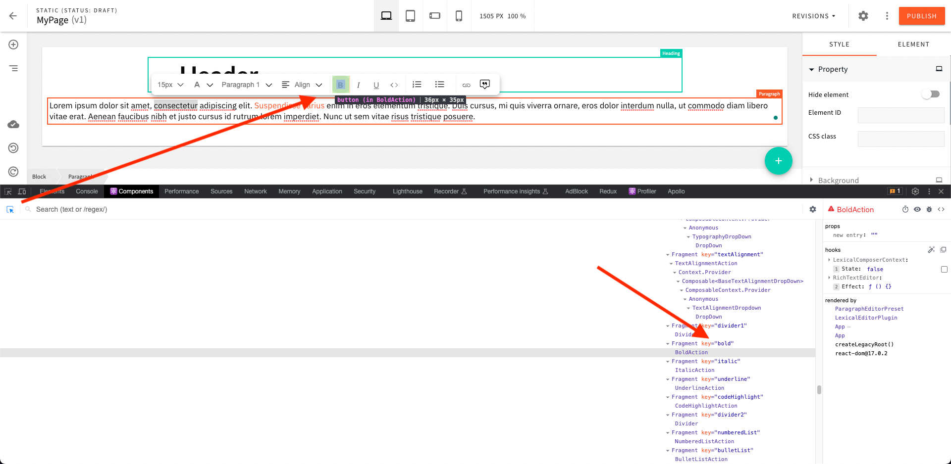 Discover Toolbar Actions
We’ve also attached a table of known action names at the bottom of the article, for your convenience.
Add an Action
To add a new toolbar action, use the <Heading.ToolbarAction> component and mount it within your Admin app.
Replace an Action
To replace an existing action with a new action element, reference the existing action by name, and pass a new element via the element prop:
Remove an Action
To remove an action, reference the existing action by name, and pass a remove prop to the <Heading.ToolbarAction> element:
Position an Action
To position an existing or a new custom action, use before or after props on the <Heading.ToolbarAction> element:
Plugins
Plugins allow you to hook into the Lexical editor state and develop custom functionality, show custom UI, etc. Please read the official docs for more information about the Lexical plugins.
Add a Plugin
To add a new Lexical plugin, you need to use the <Heading.Plugin> component and mount it within your Admin app.
Please refer to the @webiny/lexical-editor package on our Github, for real life examples of plugins.
Replace a Plugin
To replace an existing plugin with a new plugin, reference the existing plugin by name, and pass a new element via the element prop:
Remove a Plugin
To remove a plugin, reference the existing plugin by name, and pass a remove prop to the <Heading.Plugin> element:
Position a Plugin
To position an existing or a custom plugin, use before or after props on the <Heading.Plugin> element:
Built-in Plugins
| Component | Name | Description |
|---|---|---|
| FontColorPlugin | fontColor | Apply font color to the text. |
| ListPlugin | list | Format the bullet and numbered lists. |
| CodeHighlightPlugin | codeHighlight | Format code highlight. |
| TypographyPlugin | typography | Format and apply typography styles for the selected text block. |
| LinkPlugin | link | Format text to link. |
| FloatingLinkEditorPlugin | floatingLinkEditor | Manage the form and position of the floating pop-up window where the user can edit the links. |
| ImagesPlugin | images | Insert and edit an image. |
| QuotePlugin | quote | Format the selected text block to quote. This plugin will create quoteblock html tag. |
Nodes
Please read the official docs to learn what nodes are and why they’re important.
Add a Node
To add a new Lexical node, use the <Heading.Node> component and mount it within your Admin app.
Please check the official Lexical documentation for full example.
Replace a Node
To replace your custom Lexical node with a new node, reference the existing node by name, and pass a new node class via the node prop:
Remove a Node
To remove a node, reference the existing node by name, and pass a remove prop to the <Heading.Node> element:
Position a Node
To position your nodes, you can use before and after props on the <Heading.Node> element:
Paragraph Element
The Paragraph element is used for writing the main page content. The configuration API is identical to that of the Heading element. The only difference is that it has its own component namespace, so instead of LexicalEditorConfig.Heading, you need to use the LexicalEditorConfig.Paragraph namespace. Everything else is the same, so you can refer to the Heading element for the code samples and API descriptions.
Built-in Toolbar Actions
| Component | Name | Description |
|---|---|---|
| FontSizeAction | fontSize | Set font size. |
| FontColorAction | fontColor | Change the font color of the text. |
| TypographyAction | typography | Apply typography styles specified in the theme for the particular selected block of text. For example paragraph, header, list, etc. |
| BoldAction | boldAction | Set bold to the selected text. |
| ItalicAction | italic | Set the italic style to the text. |
| UnderlineAction | underline | Set underline style to the text. |
| CodeHighlightAction | codeHighlight | Apply code highlight to the text. |
| NumberedListAction | numberedList | Convert the header or paragraph text block into a numbered list. |
| BulletListAction | bulletList | Convert the header or paragraph text block into a bullet list. |
| ImageAction | image | Open File Manager where the user can select and insert one image at a time. |
| LinkAction | link | Open a pop-up where the user can set the URL and convert the text to a link. |
| QuoteAction | quote | Convert the selected text block to a quote. |