Page Builder > Theming
Page Layouts
Learn how to create and assign page layouts to pages created with Page Builder.
- how to create page layouts
- how to assign page layouts to pages created with Page Builder
Overview
All pages created with Page Builder’s page editor are rendered within a page layout.
For example, the Static page layout, that’s by default included in every Webiny project, renders pages in a relatively standard header → content → footer structure.
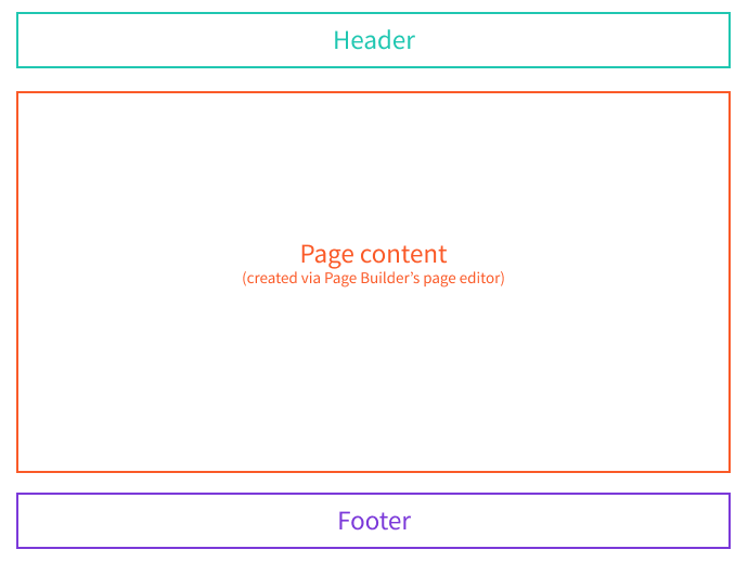 Static Page Layout
React Components and Plugins
On the code level, page layouts consist of one or more React components. For example, if we were to take a look at the Static.tsx file, located in the
 extensions/theme/src/layouts/pages folder, we would see the following code:
Essentially, the file exports a page layout React component, which renders the following:
- the actual page layout (notice extra components like
LayoutandHeader) - the page content created via Page Builder’s page editor (passed via the
childrenprop)
Depending on the requirements, page layouts can be simple or more complex. For example, the Static.tsx file also contains Header and Footer components, which are used to render the header and footer of the page layout.
Ultimately, all page layouts are registered via the PbPageLayoutPlugin, plugin, which can be done within the extensions/theme/src/index.ts entrypoint file:
The plugin is what actually makes the page layout visible in the Page Builder application and, ultimately, enables users to assign the layout to one or more pages and have their content rendered within it.
More on this in the following section.
Assigning Page Layouts to Pages
Page layouts can be assigned to pages in two ways.
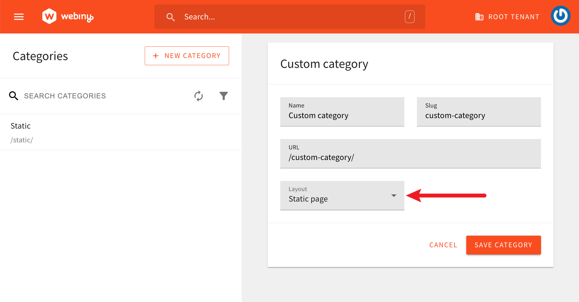
1. Page Categories
The first is by selecting a default page layout for a page category. For example, if we were to create a new Blogs category, and we selected the Static page layout in the Layout field, all pages created in the Blogs category would be rendered using the Static page layout.
 Theme Colors
Note that the layout can be changed at any time, and the change will be reflected on all existing pages that use the layout. Additionally, the layout can be changed for individual pages, which will override the default layout set via the category. This is covered in the next section.
2. Page Settings
Page layout can also be selected via page settings in the page editor. This enables us to override the default layout set via the category.
This is achieved by selecting the desired layout in the Layout field, located in the General Settings tab in the page settings area.
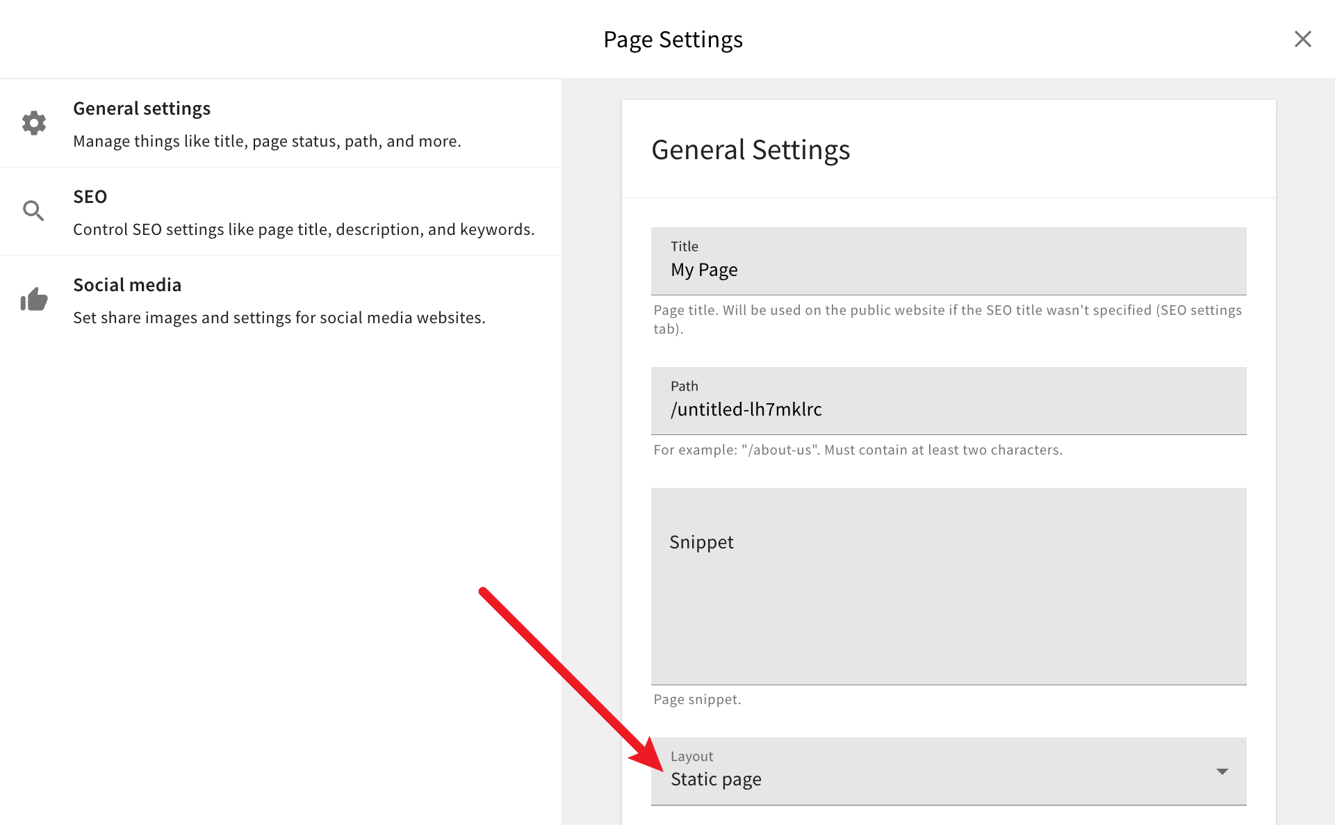 Selecting Page Layout via Page Settings
Page settings can be accessed by clicking on the cogwheel icon, located in the top right corner of the page editor.
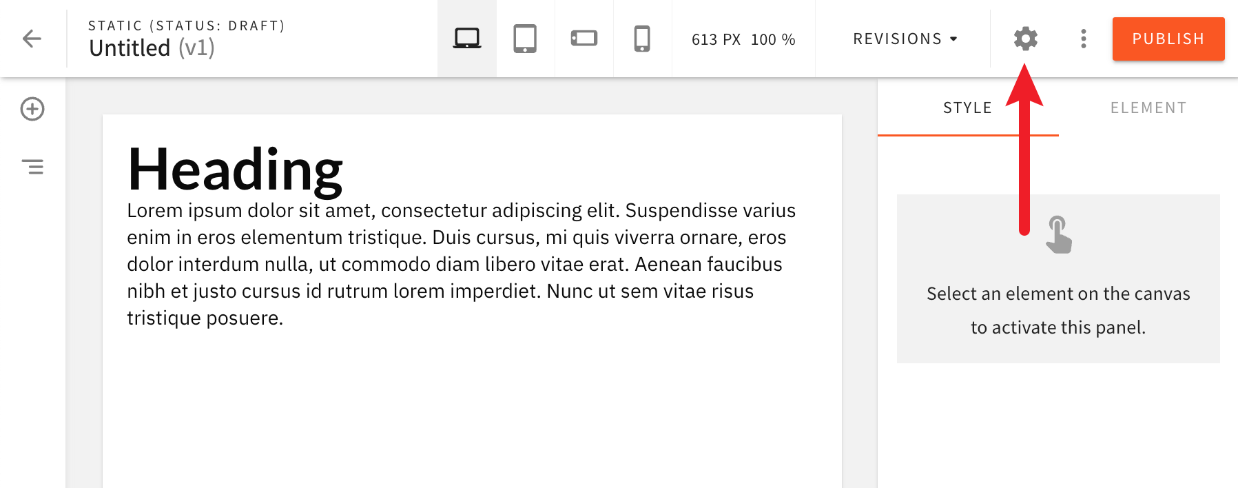 Accessing Page Settings in the Page Editor
Introducing New Page Layouts
If required, users can introduce additional page layouts into their project and use them with different pages. For example, let’s imagine we wanted to introduce a completely blank layout, that doesn’t render any header or footer.
Like with the Static page layout, we would need to create a new page layout React component, and register it via the PbPageLayoutPlugin plugin.
For the component, the following would be all the code that’s required:
And for the registration, we would need to add the following to the extensions/theme/src/index.ts file:
With the above code in place, we should be able to create pages and select the Blank page layout to be used.
Styling Page Layouts
As mentioned in the Introduction section, Webiny relies on Emotion for all of the styling needs. This includes styling of page layouts.
If we were to take another look at the extensions/theme/src/layouts/pages/Static.tsx file, we could notice the Emotion’s Global component being used to inject global styles into the page. We could also notice the usage of the @emotion/styled package, which enables us to create styled components. In this case, the Layout component.
The Header and Footer components that are being included in the layout are also styled using Emotion.