Website Builder > Configure Theme
Configure Theme
Customize colors, typography, and responsive styling in the Website Builder theme system.
- How the theme system connects
theme.css,theme.ts, and the editor - How to customize colors and typography that editors can use
- How to use CSS variables and
clamp()for responsive styling - How to load custom fonts across your app and the editor
Overview
The Website Builder theme defines the visual language that content editors work with—the colors they can pick, the typography styles they can apply, and how text scales responsively across devices. The theme is defined in your Next.js project and injected into both your app and the Admin editor so they share identical styling.
Theme Architecture
The theme system has three files that work together:
theme.css — Defines CSS custom properties (variables) for colors and CSS classes for typography styles. This file is injected into both the Next.js app and the Admin editor iframe.
theme.ts — Calls createTheme() to build a typed theme object that tells the editor which colors and typography styles are available in its toolbar and color picker.
tailwind.css — Bridges the Website Builder CSS variables to Tailwind’s color token system, enabling bg-primary, text-primary, etc. in your components.
A webpack plugin (injectThemeCss in next.config.ts) reads theme.css at build time and makes its contents available to createTheme() via the __THEME_CSS__ global.
Theme CSS
The theme.css file defines all semantic color variables and typography classes:
CSS variables use semantic names (--wb-theme-color-primary, --wb-theme-color-text-base). Typography classes use clamp() for fluid responsive sizing without media queries.
Tailwind Bridge
The tailwind.css file maps Website Builder CSS variables to Tailwind’s color tokens:
This bridge enables bg-primary, text-primary, and other Tailwind utilities in your components. They resolve to the same values as the Website Builder theme variables, keeping the editor preview and live site in sync.
Theme Registration
The theme.ts file exports a theme object that the SDK uses to populate the editor’s color picker and typography toolbar:
The colors array populates the editor’s color picker. Each entry has an id, label, and value (typically a CSS variable reference). The typography object covers headings, paragraphs, quotes, and lists—each entry maps a CSS class to an HTML tag and a label shown in the editor toolbar.
 The Website Builder editor showing the color picker open with all theme colors available for selection
The exported theme and css are imported in initializeContentSdk and passed to contentSdk.init().
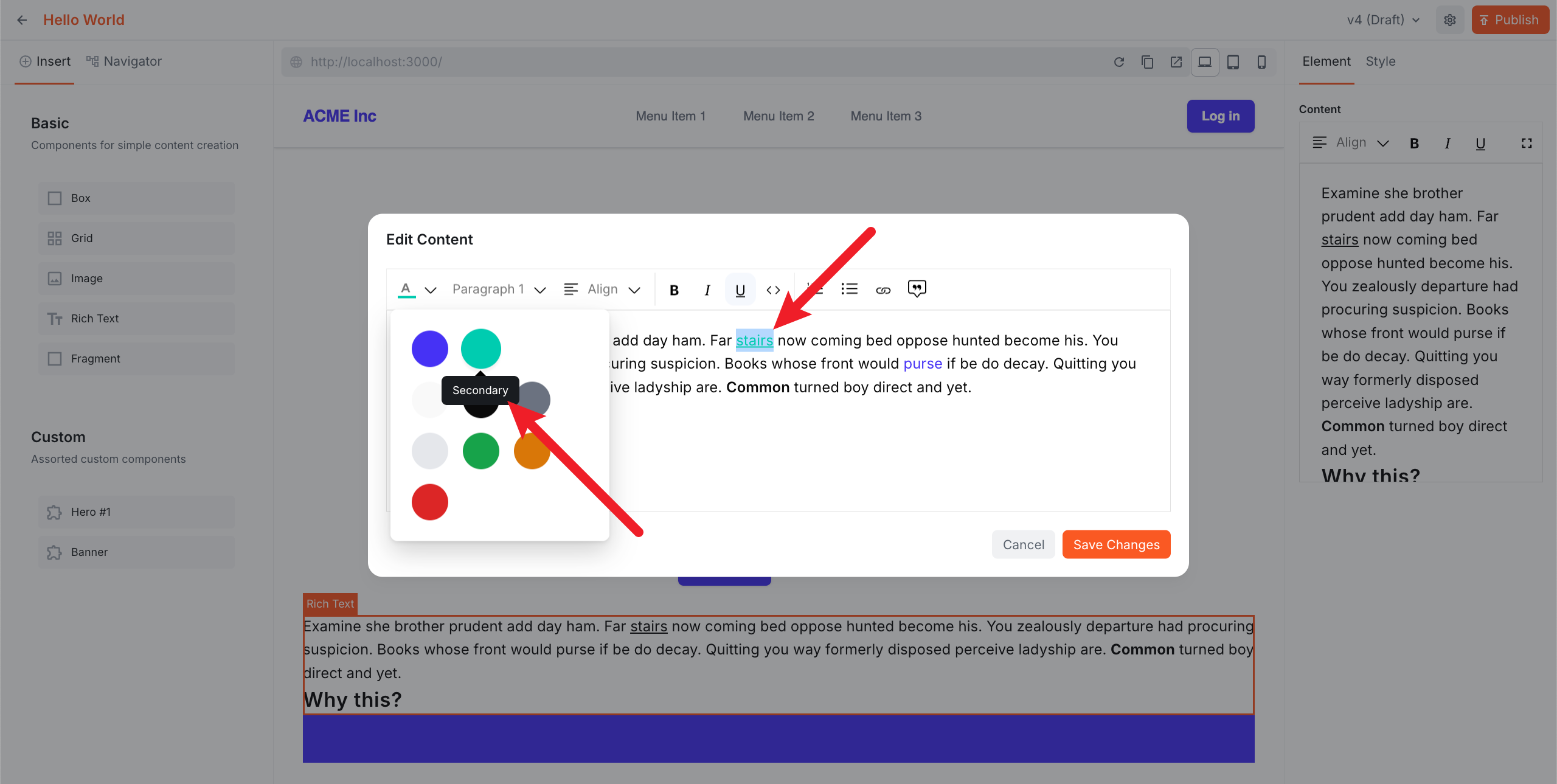
Customizing Colors
For colors that editors can pick in the Admin, follow a two-step pattern: define the color variable in theme.css, then register it in the colors array in theme.ts.
To change the primary color:
The change propagates automatically to rendered pages, Tailwind tokens, and the Admin editor color picker.
 The Next.js page rendered with a green theme after changing the primary and secondary color variables in theme.css
For colors that are not meant to be selectable by editors (border radius, shadows, component-specific colors), define them directly in your component CSS or Tailwind classes—theme.ts is not involved.
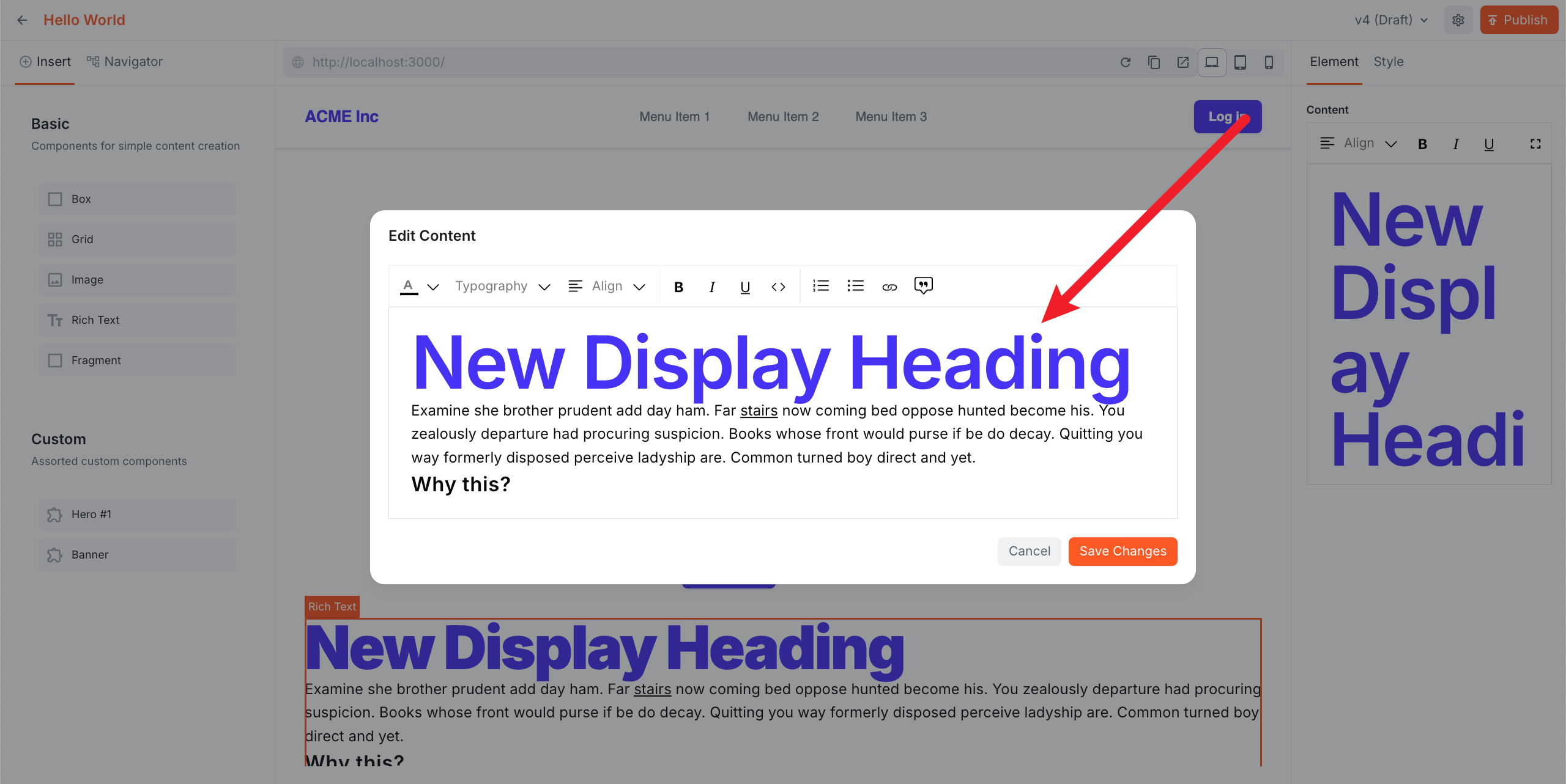
Customizing Typography
To add or modify a typography style, update both theme.css and theme.ts:
The editor will now show “Display” as an option in the typography toolbar.
 The Website Builder editor showing the custom Display heading style applied to text in the rich text editor
Loading Custom Fonts
To switch fonts (e.g., from Inter to Geist), update four files:
src/app/layout.tsx — swap the font import and config:
src/theme/tailwind.css — update the --font-sans token:
src/theme/theme.css — update the CSS variable:
src/theme/theme.ts — update the fonts array so the editor iframe loads the font:
The fonts array injects the font into the editor iframe, ensuring the Admin preview matches the live site.
Matching Font Weights
If you load multiple font weights in layout.tsx, include the full weight range in the fonts URL. For example:
The fonts array must include the same range:
Mismatched weights will cause text to render incorrectly in the editor—bold text may appear regular weight, or vice versa.
Responsive Styling
Typography classes use clamp() for fluid responsive sizing out of the box. No media queries are needed for text scaling, though you can add them if finer control is required.
For layout inside your custom components, use Tailwind’s responsive prefixes as normal:
The editor has built-in device controls (desktop, tablet, mobile) in the toolbar for previewing responsive layouts directly in the Admin.
 The Website Builder editor with the mobile device control active, showing the page rendered at a narrow mobile viewport width
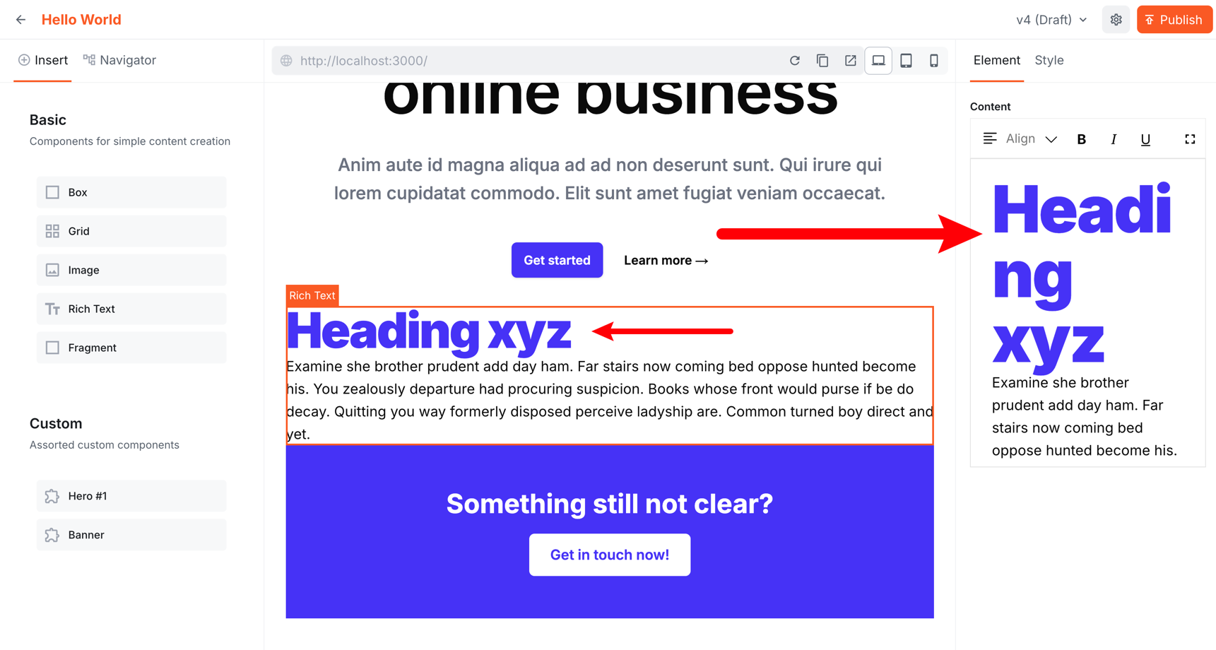
Clamp() Sizing Differences
When using clamp() or rem-based font sizes, text may appear at different sizes on the editor canvas versus the rich text editor sidebar. This is expected—clamp() scales with viewport width, and rem is relative to the root font size, both of which differ between the full-page canvas and the narrower sidebar container.
 The Website Builder editor showing a heading that appears at a different size on the canvas versus the rich text editor sidebar
This is CSS behavior, not a bug. If pixel-perfect consistency between the canvas and rich text editor is required, use fixed px values instead of clamp() or rem:
In practice, this is rarely an issue—what matters is how the page looks on the published site.