Theming and Styling
In this lesson we'll cover how the Website Builder theme works, how to customise it, and how responsive styling is handled — so what editors see in the Admin matches what visitors see on the published site.
In this lesson...
Here are the topics we'll cover
Understand how the theme is defined and injected.
Customise colours and typography in theme.css and theme.ts.
Use clamp() and Tailwind for responsive styling.
How the Theme System Works
The Website Builder theme has two parts that work together:
-
theme.css— Defines CSS custom properties (variables) for colours and CSS classes for typography styles. This is injected into both the Next.js app and the Admin editor so they share the same visual language. -
theme.ts— CallscreateTheme()to build a typed theme object. This tells the editor which colours and typography styles are available in its toolbar and colour picker.
There's also a third file — tailwind.css — which bridges the WB CSS variables to Tailwind's color token system. This is what makes bg-primary, text-primary, etc. work in your components.
The webpack plugin injectThemeCss (configured in next.config.ts) reads theme.css at build
time and makes its contents available to createTheme() via the __THEME_CSS__ global.
The theme.css File
Open src/theme/theme.css:
CSS variables use semantic names (--wb-theme-color-primary, --wb-theme-color-text-base, etc.). Typography classes use clamp() for fluid responsive sizing — no media queries needed.
The tailwind.css File
src/theme/tailwind.css bridges WB CSS variables to Tailwind's color tokens:
This is why you can use bg-primary, text-primary, etc. in your components — they resolve to the same values as the WB theme variables, keeping the editor preview and the live site in sync.
The theme.ts File
Open src/theme/theme.ts:
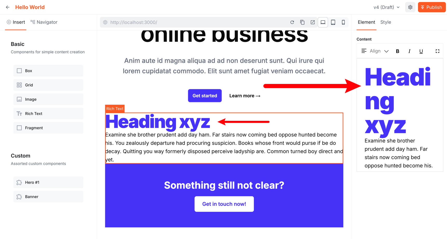
The colors array (each item: id, label, value) populates the editor's colour picker. The typography object covers headings, paragraphs, quotes, and lists — each entry maps a CSS class to a tag and a label shown in the editor toolbar.
The exported theme and css are imported in initializeContentSdk and passed to
contentSdk.init().
Customising the Theme
For styles that editors can pick in the Admin — colours and typography — always follow the same two-step pattern: define the style in theme.css, then register it in theme.ts so it appears in the colour picker or typography toolbar.
For everything else (border radius, spacing, shadows, component layout) you just write Tailwind or CSS directly in your components — theme.ts is not involved.
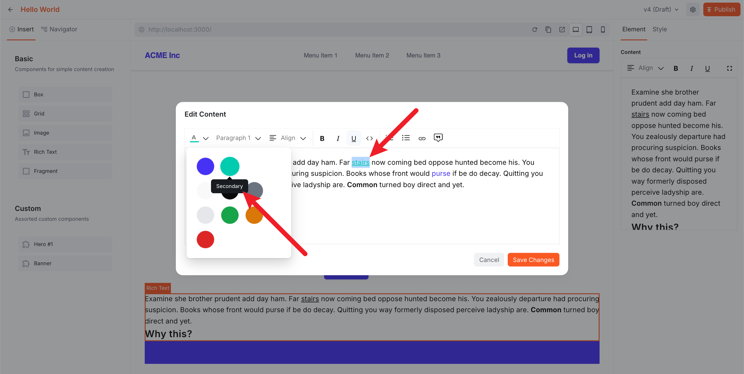
Customising Colours
To change the colour palette, edit the CSS variables in theme.css:
The change propagates automatically to the rendered pages, the Tailwind tokens, and the Admin editor colour picker.
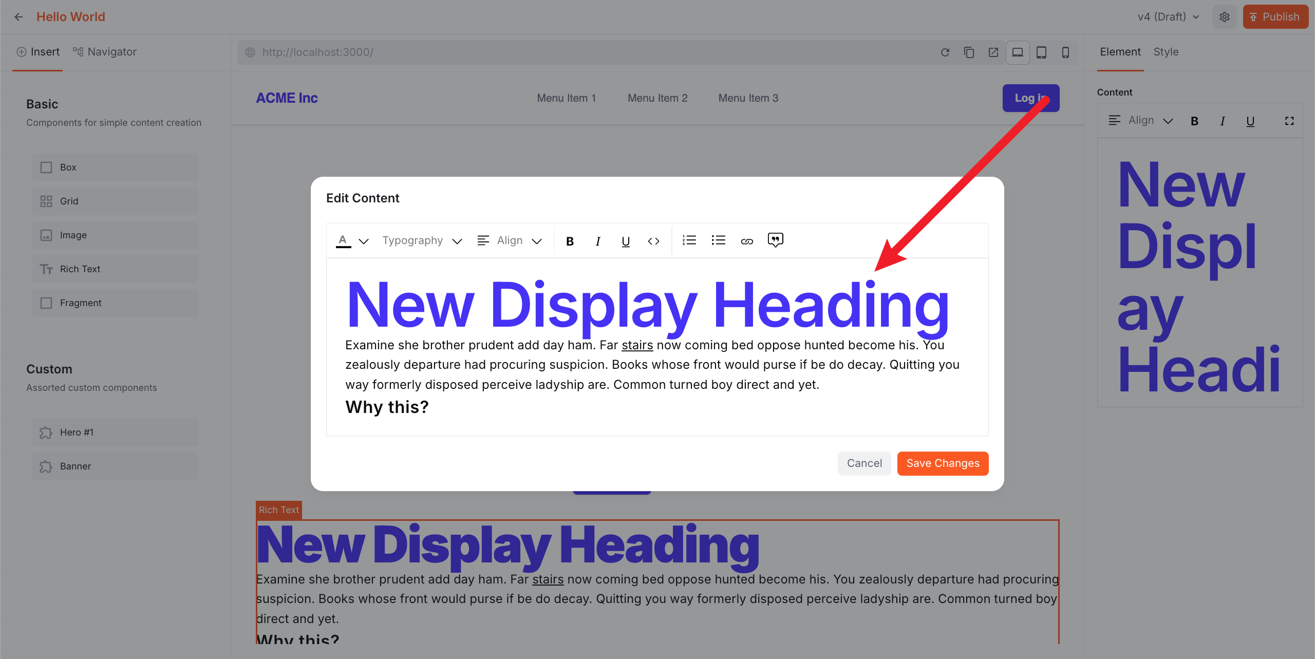
Customising Typography
To add or modify a typography style, update both files:
The editor will now show "Display" as an option in the typography toolbar.
Loading Custom Fonts
The starter kit uses Inter by default. Here's how to switch to Geist — you need to update four files.
src/app/layout.tsx — swap the font import and config:
src/theme/tailwind.css — update the --font-sans token:
src/theme/theme.css — update the CSS variable:
src/theme/theme.ts — update the fonts array so the editor iframe gets the font too:
The fonts array injects the font into the editor iframe so the Admin preview matches the live site.
Responsive Styling
Typography classes already use clamp() for fluid sizing out of the box — no media queries needed for text, though you can still add them if you need finer control. For layout inside your custom components, use Tailwind's responsive prefixes as normal:
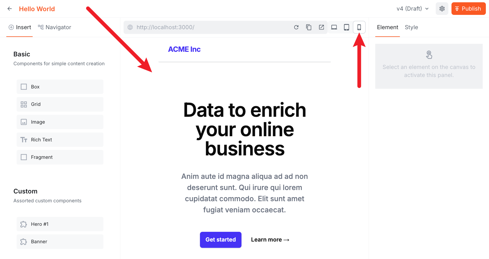
The editor has built-in device controls (desktop, tablet, mobile) in the toolbar — use them to preview responsive layouts directly in the Admin without leaving the editor.
Troubleshooting
Text sizes look different between the editor canvas and the rich text editor sidebar
When using clamp() or rem-based font sizes, you may notice the text appears at a different size on the editor canvas versus the rich text editor sidebar (and sometimes compared to the live site). This is expected — clamp() scales with the viewport width, and rem is relative to the root font size, both of which differ between the full-page canvas and the narrower editor sidebar container.
This is a CSS behaviour, not a bug. If you need pixel-perfect consistency between the canvas and the rich text editor, use fixed px values instead of clamp() or rem:
/* consistent across canvas and sidebar */
font-size: 64px;
line-height: 64px;
In practice this is rarely an issue — what matters is how the page looks on the published site.
Fonts look different in the editor vs the live site
The most common cause is a mismatch between the font weights loaded in layout.tsx and the font URL in the fonts array.
For example, if layout.tsx loads all weights:
But theme.ts only requests the default weight in the Google Fonts URL:
Then the editor iframe only has the default weight (400) available. Text that should be bold or light will appear at the wrong weight in the editor canvas and the rich text editor.
Fix it by including the full weight range in the URL:
The rule of thumb: whatever weights you load in layout.tsx, load the same range in the fonts URL.
Summary
theme.cssdefines semantic CSS variables for colours andclamp()-based typography classes.theme.tsexportsthemeandcssviacreateTheme()— these are passed tocontentSdk.init().tailwind.cssbridges WB CSS variables to Tailwind tokens — this is whybg-primaryworks in components.- For styles editors can pick in the Admin (colours, typography): define in
theme.css, register intheme.ts. For everything else, use Tailwind or CSS directly in your components. - When switching fonts, update all four places:
layout.tsx,tailwind.css,theme.css, and thefontsarray intheme.ts. - The editor has built-in device controls (desktop, tablet, mobile) for previewing responsive layouts without leaving the Admin.
Next lesson: Build an article listing component that fetches content from the Headless CMS.
It's time to take a quiz!
Test your knowledge and see what you've just learned.