Editor Components
Editor components are the building blocks that content editors use to compose pages in the Website Builder. In this lesson you'll learn what they are, how they're registered, and how to build your own.
In this lesson...
Here are the topics we'll cover
Understand the anatomy of an editor component.
Register components with createComponent and createTextInput.
Build a custom Banner component from scratch.
Prerequisites:
- Starter kit running locally (previous lesson)
- Webiny Admin app running (locally via
yarn webiny watch admin, or deployed CloudFront URL)
What Is an Editor Component?
Recall from the previous lesson: the Website Builder editor loads your Next.js app in an iframe. The SDK running inside that app is responsible for telling the editor which components are available. An editor component is how you describe one of those components to both sides — the editor and the renderer.
It has two parts:
- The React component — your regular React code that renders the UI, with your styles, your markup, completely in your codebase. It receives editor-configured values via an
inputsprop, typed withComponentProps<YourInputs>from the SDK. - The manifest — metadata that tells the editor about the component: its name, label, group, and what inputs (configurable props) it exposes to the editor sidebar.
You combine both using createComponent() from @webiny/website-builder-nextjs, then add the result to the editorComponents array that you pass to DocumentRenderer.
The editorComponents Array
Open src/editorComponents/index.tsx in the starter kit:
A few things to notice:
- The file is marked
"use client"— component registrations must run on the client, because the SDK communicates the available components to the editor via the browser. createComponenttakes the React component as its first argument and the manifest as the second.nameis a namespaced string — use a consistent convention like"YourNamespace/ComponentName".inputsdefines the configurable props that appear in the editor sidebar. An empty array means no inputs — the component renders with fixed content.group(optional) links the component to a named component group in the editor palette.
Component Groups
Component groups organise the editor's component palette into sections. They're registered in src/contentSdk/groups.ts:
The filter option on the "custom" group is a catch-all: it collects any component that doesn't have an explicit group set in its manifest.
Building a Custom Component
Let's build a simple Banner component — a full-width coloured strip with a headline and a call-to-action button link.
Step 1: Create the React Component
Create src/editorComponents/Banner.tsx:
Always type your component with ComponentProps<YourInputs> from @webiny/website-builder-nextjs.
Without it, TypeScript won't know the shape of the inputs prop and you'll get type errors.
Step 2: Register the Component
Replace the contents of src/editorComponents/index.tsx with:
Step 3: Test It
- In the Admin sidebar, go to Website Builder → Pages.
- Open an existing page or create a new one.
- In the component palette, look for the Custom group — your Banner component should be there.
- Drag it onto the canvas. Click the component to select it — the right sidebar will show the inputs you defined: Headline, Button Label, and Button URL.
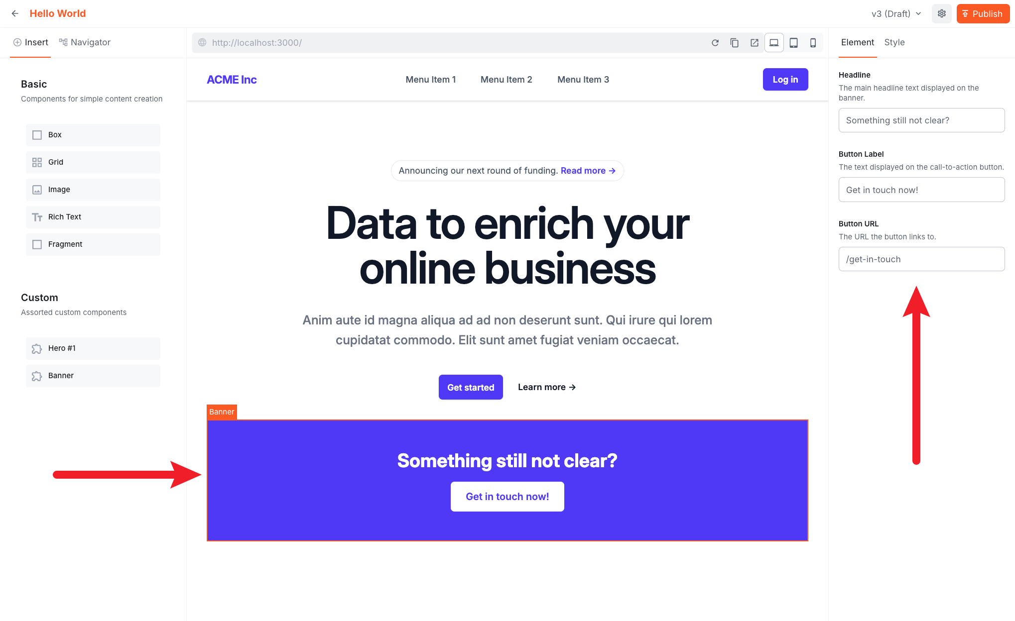
- Fill in the inputs and click Publish.
- Visit your Next.js app and refresh the page to see the rendered banner.

The Banner is a simple example to illustrate the pattern. In the upcoming lessons you'll build more components — including one that fetches and renders content from the Headless CMS.
Input Types
The SDK exports a factory function for each input type:
| Function | Use case |
|---|---|
createTextInput | Single-line text, URLs, labels |
createLongTextInput | Multi-line text |
createNumberInput | Numeric values |
createBooleanInput | Toggle / checkbox |
createColorInput | Colour picker |
createDateInput | Date / date-time picker |
createSelectInput | Dropdown with predefined options |
createRadioInput | Radio button group |
createTagsInput | List of tags |
createObjectInput | Nested object (group of sub-inputs) |
createLexicalInput | Rich text (Lexical editor) |
createFileInput | File / media picker |
createSlotInput | Slot for nesting other components |
Summary
- Editor components combine a React component with a manifest (name, label, group, inputs).
createComponentandcreateTextInputare the primary registration APIs.- Component groups are registered in
groups.tsand organise the editor palette. - Component names are stored in page documents — treat them as stable identifiers, renaming breaks existing pages.
Next lesson: Learn how theming and responsive styling work in the Website Builder.
It's time to take a quiz!
Test your knowledge and see what you've just learned.